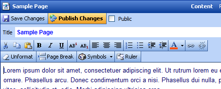
Once a page has been selected from the Pages tab, its title and content will appear within the Content Area. It is within the Content Area that all text and graphical changes are made. Much of the interface and functionality is similar to Microsoft Word and should be relatively intuitive for Word users.
) |
| Content Area (click to enlarge) |
The page title appears in three places within the editing area:
- The title appears under the Pages tab, allowing the page to be selected for editing.
- The title appears at the top of the Content tab, specifying the page that is currently selected for editing.
- The title appears within the Title editing window, allowing users to edit the name of the page.
) |
| The page title appears in three places as shown by the red outlines |
To change the title of a page, simply highlight the title within the Title Editing Window, type in the new title and hit the Save button.
) |
| Editing controls for the page title |
The text editing features are fairly extensive and will be explained individually. Unless specified otherwise, the standard approach to text editing is to highlight the text to be edited then select a formatting button, such as  (for bold text). Each formatting button is covered on the following pages.
To cut text from the page, highlight the text and hit the  button. The Windows keyboard shortcut Ctrl-X can also be used.
To copy text from the page, simply highlight the text and hit the  button. The Windows keyboard shortcut Ctrl-C can also be used.
To place text that was Copied or to replace text that was just Cut, place the cursor in desired space and hit the  button. The text that was Copied or Cut will reappear on the page. The Windows keyboard shortcut Ctrl-V can also be used.
To assign Bold formatting to text, highlight the text and hit the  button as shown below. Bolding can be undone by hitting the button again or by hitting the Unformat button. The text needs to remain highlighted for the changes to take effect. The Windows keyboard shortcut Ctrl-B can also be used.
To assign Italic formatting to text, highlight the text and hit the  button as shown below. Italics can be undone by hitting the button again or by hitting the Unformat button. The text needs to remain highlighted for the changes to take effect. The Windows keyboard shortcut Ctrl-I can also be used.
To assign Underline formatting to text, highlight the text and hit the  button as shown below. Underline can be undone by hitting the button again or by hitting the Unformat button. The text needs to remain highlighted for the changes to take effect. The Windows keyboard shortcut Ctrl-U can also be used.
To assign Superscript formatting to text, highlight the text and hit the  button as shown below. For Subscript, hit the
  button. Either Superscript or Subscript can be undone by hitting the respective button again or by hitting the Unformat button. The text needs to remain highlighted for the changes to take effect.
To change text alignment, highlight text and select one of the three alignment buttons as shown below.
Left align
Center align
Right align
Please note: the Unformat button does not work with undoing alignment. Simply use the appropriate alignment button to return your text to its original alignment state.
To create a numbered list, place the blinking cursor on a new line and hit the  button. Numbered lists can be undone by selecting the button a second time, or by selecting the Unformat button.
While the cursor is within a numbered list, hitting the Enter key on the keyboard will add a new numbered item in the current spot. Hitting the Enter key a second time will make the new item a normally formatted paragraph instead of a list item (in effect 'exiting' out of the list).
To put additional line spaces between numbered items, hold down the Shift key and hit Enter at the end of a line. This will add a single line-break instead of creating a new numbered item.
Tip: Numbered Lists can easily be changed to Bulleted Lists as well. Simply select the  button while positioned within a Numbered List.
Example of Numbered List
- Item one
- Item two
- Item three
To create a bulleted list, place the blinking cursor on a new line and hit the button. Bulleted lists can be undone by selecting the button a second time, or by selecting the Unformat button.
While the cursor is within a bulleted list, hitting the Enter key on the keyboard will add a new bulleted item in the current spot. Hitting the Enter key a second time will make the new item a normally formatted paragraph instead of a list item (in effect 'exiting' out of the list).
To put additional line spaces between bulleted items, hold down the Shift key and hit Enter at the end of a line. This will add a single line-break instead of creating a new bulleted item.
Tip: Bulleted Lists can easily be changed to Numbered Lists as well. Simply select the button while positioned within a Bulleted List.
Example of Bulleted List
- Item one
- Item two
- Item three
Indenting and outdenting moves the left hand margin in and out respectively. Indenting/outdenting can be used repeatedly on the same paragraph to move its left margin several places in or out. Indents can be undone by hitting Outdent the same number of times, and vice versa. As with other formatting, this can also be undone by keeping the text highlighted and selecting Unformat.
Indent
Outdent
You can use the Indent Button in a Bulleted or Numbered List to create additional outline levels.
Example of Bulleted List with Indented Items
- First item
- Second item, indented once
- Third item, indented twice
- Second item, indented once
- Fourth item
Color can be applied to text, both foreground (the text itself) and background (the space behind the text).
To change the foreground color, simply highlight text and hit the  button. To undo color changes, highlight text and select Unformat.
To change the background color, do the same as above as above, but hold down the Shift key while applying the color. To undo, highlight the text and select Unformat.
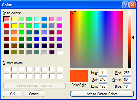
The color that will be applied is the same color as the bar underneath the 'A' in the Color button, in this case, red: . You can select a different color to apply by hitting the dropdown arrow to the right of the Color button. This shows a menu of 140 basic colors (known as 'web-safe' colors). Options for Custom Hex Color... and More Colors... are also present.
) |
| Color dropdown menu (click to enlarge) |
The latter option brings up the Windows color dialog, allowing you to select any color desired.
 |
The Unformat button ( ) affects highlighted text by removing the last formatting applied. This includes Bold, Italic, Underline, Superscript, Subscript, Indent, Outdent, Numbered List, Bulleted List, and Color. The only formatting that the Unformat feature does not undo is Left, Center and Right alignment, which are undone by selecting a different alignment.
The Page Break button ( ) is an optional control used only by specially programmed templates. It inserts a marker that divides the content into multiple pages. This is sometimes useful with long articles, but without support for page breaks in the chosen template, inserting a page break will conceal any content after the first page.
) |
| Example of page break (click to enlarge) |
To accommodate special characters such as Copyright or Registered Trademark symbols, or foreign language words with special punctuation, a Symbols feature is included. Simply place the cursor in the location where the character is to appear, then select it from the drop down menu of the Symbols button ( ).
).
) |
| Symbols dropdown menu (click to enlarge) |
The Ruler button ( ) toggles the display of a ruler down the length of the Content area. This is helpful when creating multi-page documents (see the Page Break description above) to ensure that pages are uniform in length.
Clicking anywhere in the scaled portion of the Ruler will cause the measurement units to start at that exact point (for example at the placement of a page break). Clicking at the top part of the Ruler will realign the Ruler with the beginning of the page.
Because editable content is fixed width, a corresponding ruler is not displayed across the width of the Content area.
) |
| Ruler control |
In order to save changes after editing, hit the Save Changes button.
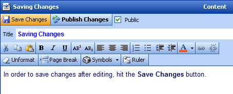 |
| Save Changes button |
Note: Save Changes does not make the changes to the site public. See Publishing/Submitting Changes below.
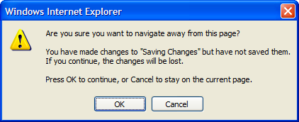
If changes are not saved before going on to another page, a pop-up dialog box will appear to make sure that you understand that your changes will be lost. From this dialog box hit OK to move on (and lose changes) or Cancel to stay on the current page where you can then select Save Changes.
 |
It is possible to return to a previous save by hitting the Undo Last Save button as show below. This undoes the changes made since the last time Save Changes was used. It is only present when changes have been saved but not published.
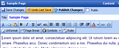 |
| Undo Last Save button |
The Publish Changes button publishes the current page so that all changes are live on the website. This button appears when Administrators and Editors edit a page's content.
 |
| Publish Changes button |
The Submit to Editor button forwards an email notice to the designated Group Manager for the current page, notifying him or her that an Author has requested approval of saved changes. The Group Manager can click on a link in the email to see the latest changes. Separate save and publish/submit buttons allow a page to be edited and changes approved without affecting live content.
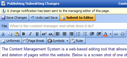 |
| Submit to Editor button |
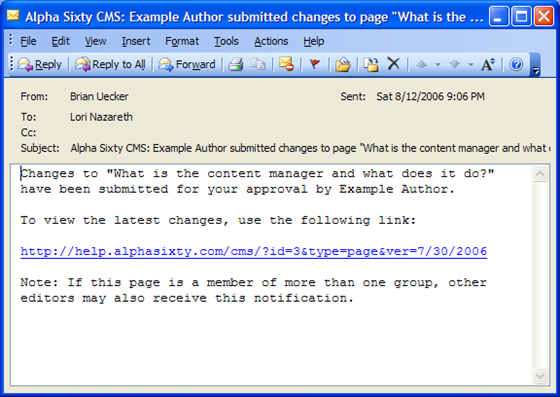 |
| Sample email notification |
For Administrators, the Public checkbox from the Properties Screen appears alongside the Save and Publish buttons. Clicking the checkbox toggles the state of the page between public and private. Editors and Authors cannot change the public status and therefore the checkbox is not displayed to them.
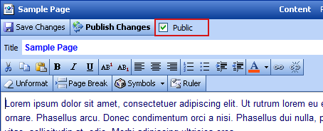 |
| The public checkbox as it appears in the editor |
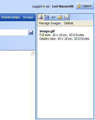
By selecting the Images tab ( ) on the top right hand side of the screen, photos and illustrations can be uploaded and placed on the page. The Image Manager can handle the following common graphic formats: JPEG, GIF, and PNG.
 |
| Images tab |
Before they can be placed, images must be located on your computer and uploaded. Hit the Manage Images button to upload images.
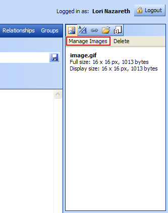 |
| Manage Images button |
After hitting the Manage Images button, the Image Manager pop-up box will appear. Hit the Browse... button to locate images on your computer.
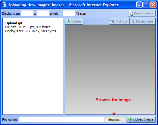 |
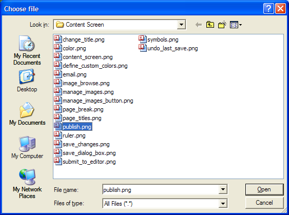
Once Browse has been selected, a standard Windows file selection dialog box appears. Change to the place on your computer where you have local copies of the images you wish to upload. Once the desired image has been found, select it and hit Open.
 |
Note: Images are grouped together by web page. Images uploaded for one web page will not be selectable when editing another web page (the image must be uploaded separately for each page). This is to prevent the situation where an image no longer used on one web page is deleted, causing a broken image to appear on another web page that shares the same image. Images are not shared, so this problem cannot occur.
Each uploaded image must have a unique name. When uploading image files of the same name, the uploaded image will overwrite the existing image.
The name of the selected image (along with its path) will appear in the File Name field to the left of the Browse... button. To upload the image, hit the Upload Image (
 ) button.
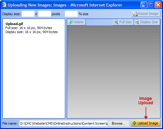 |
Once Upload Image has been selected, the image name will appear on the top left and the image itself will appear on the right. The image will also be available from the Images tab.
Image Formats
The Image Manager will accept three image formats: JPEG, GIF, and PNG. JPEG is recommended for use with photographic images because its compression methods are optimized for high detail. PNG is better suited for solid-color illustrations, charts, and many screenshots because its compression methods are optimized for low color palettes and large areas of the same color. GIF is an older image format similar to PNG but less flexible. Resizing GIFs in the Image Manager tends to produce excessive dithering due to the format's palette restrictions.
When a large image is uploaded, the Content Management tool will reduce its size if it exceeds 300 x 300 pixels in size. You can view its full size and also the size in which it will appear on the Web page. To view the full size, simply hit the Full Size button ( ). The full size image will appear in a pop-up window. To view the size that it will appear on the page, hit the Display Size button (
 ). The display size image will appear in a pop-up window. If the image is smaller than 300 x 300 pixels, its display size will be the same as its preview size.
Tip: If after uploading an image you wish to remove it, simply hit the Delete button ( ).
).
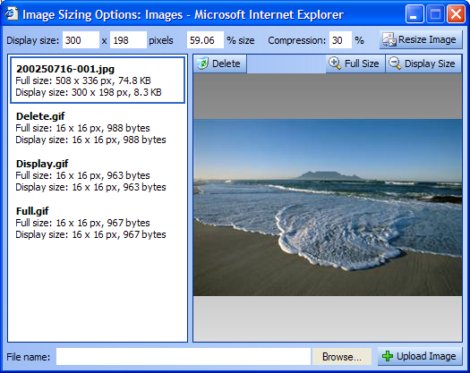 |
Full size vs. display size
The full size is always the actual size of the image that was uploaded, and may be considerably larger than the size you wish to show in the page content. The display size is the size of the image that will be inserted into the page content. When changes are made to an image (see below sections), they are made to a new copy of the full size image to prevent image degradation.
The image display size is shown in both pixels and percentage of full size. If you wish to change the size that the image will display on the web page, you can either adjust the pixel dimensions or the percentage. Once the new values have been entered, hit the Resize Image button ( ).
).
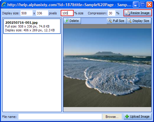 |
If you resize an image that has already been inserted into the web page, you will need to refresh the image in the content area to update its new dimensions, which were set when it was inserted. To do this, right-click the image that has been resized and select Refresh from the context menu.
) |
| Image context menu |
Note: When the display size exceeds the boundaries of the preview area, it will be shown at its actual size but centered within the preview area boundaries. You can hit the Display Size button once again to view the complete image at display size (as it will appear when inserted into page content).
Once the desired images have been uploaded, close the Image Manager pop-up box to return to the main content entry screen. To insert an image into the page, place the cursor in the desired location and click twice on the image name within the Manage Images list on the right side of the screen. The image will appear in the content area at the cursor position.
Note: If the image name is already selected it will show a blue border. If this is the case you only have to click on it once to insert it at the current cursor position.
To change the placement of the image, the simplest way is to right-click on the image, select Remove, and then position the cursor at the desired location and reinsert the image into the page.
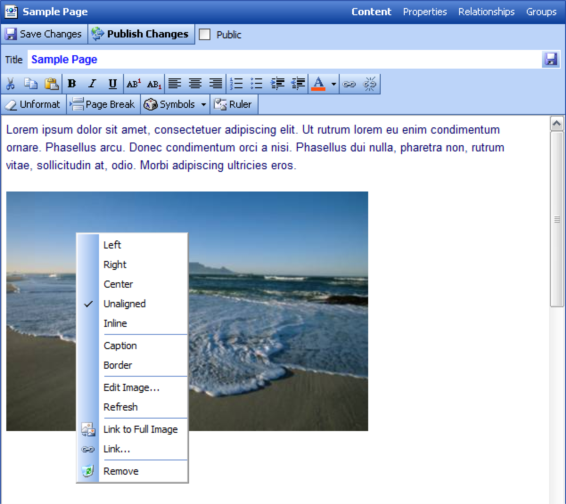
Images can be aligned within the text area, for example to allow text to flow around the image. To see the alignment options, right click on the image to get the image pop-up menu.
This menu provides the options for Left, Center, Right, Unaligned, and Inline. Left places the image to the far left of the text, Right to the far right of the text, Center places the image in the middle of the text, and Unaligned places the image by itself (no text wrap) with text appearing only above and/or below. By default when a new image is inserted it is Unaligned.
A fifth option, Inline, allows images to be placed within the flow of the text, for example in the middle of a sentence. Inline images cannot have special features such as captions or borders. They are useful for inserting small icons and characters not available to standard HTML character sets.
 |
| Alignment options in the image context menu |
Tip: An inline image is enclosed by a SPAN tag. You can use the Style Manager to create a style for this tag and apply it by highlighting the image as you would some text, then applying the style you have created. This can be used to adjust the alignment of the image with the surrounding text. This option is not available for other image alignments.
Captions can be added to all images except Inline images. Simply right-click on the image to get the image pop-up menu and select Caption. The placeholder text 'type caption here' will appear below the image. Highlight this placeholder text and type your caption.
Captions can be changed by placing the cursor in the caption area and directly editing them.
Captions can be removed by right clicking on the image and once again selecting Caption. This will toggle the caption off.
 |
| type caption here |
With some images that don�t have distinctive edges (for example, one that fades to white and blends into the page itself) it might be useful to apply a border. The Border feature is accessed by right-clicking on the image and selecting Border from the image pop-up menu.
Borders can be removed by once again right-clicking on the image and selecting Border from the image pop-up menu.
 |
Expert Note: The border properties (color, size, padding from image) are preset in the /res/css/global.css stylesheet. This file is not editable using the CMS, but can be modified by downloading the file directly and uploading changes using FTP software. This stylesheet contains a section marked /* Global image styles */ which sets the style properties of the border, caption, and alignment state used by the CMS.
If after placing an image on the page it still requires sizing adjustments, you can right click and select Edit Image to once again open the Image Manager window. Here you can adjust the display size dimensions as covered previously.
From the image context menu, images can be linked to either their full-size version or to some other type of content (another page, a PDF, etc.).
When linking the full size image, the display size image will appear on the page, and when clicked, a separate browser pop-up window will appear with the full size image. To link to a full size image, simply right-click on the image and select Link to Full Image from the dropdown menu.
For more information on linking images to other types of content, please refer to the Managing Links section.
Images can be removed from the page by selecting Remove from the image context menu. This does not delete the image file itself. After removal the image can be re-inserted from the Manage Images display on the right.
To help keep content consistent from page to page, styles can be created for special text formatting, such as headings, lists, hyperlinks, and paragraphs. Styles are created and applied using the Styles tab ( ) on the top right hand side of the screen.
 |
| Styles tab |
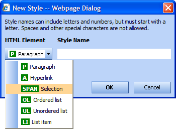
There are six HTML elements for which styles can be created. They are:
- Paragraph (P)
Paragraphs are the basic block elements used in the web pages created with the Content Manager. When the Enter key is pressed it automatically creates a new paragraph. Paragraph styles can be applied by placing the cursor anywhere in the paragraph and clicking on a paragraph style.
- Hyperlink (A)
Hyperlink styles can be applied to any link created on a web page. Note that to make hyperlinks more visible in the Content Manager, they are displayed with a red secondary underline. This underline is not visible on the actual website. - Selection (SPAN)
Selection styles can be applied to text selections and inline images. - Ordered List (OL)
Ordered List styles can be applied to lists created using the button.
- Unordered List (UL)
Unordered List styles can be applied to lists created using the button.
- List Item (LI)
List Item styles can be applied to individual items within an ordered or unordered list.
Attempting to apply a style to the incorrect HTML element will result in no change. For example, if the cursor is positioned in a paragraph, selecting an ordered list style will not change the paragraph style. The paragraph must be converted to an ordered list first.
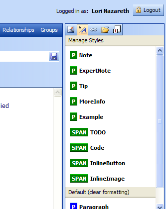
Hit the Manage Styles button in the Styles tab to create a new style.
 |
| Manage Styles button |
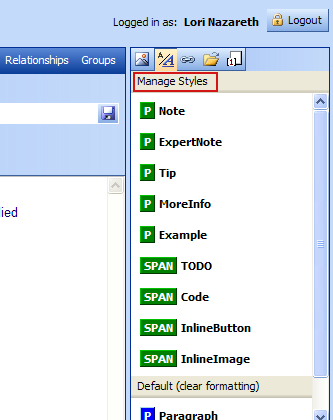
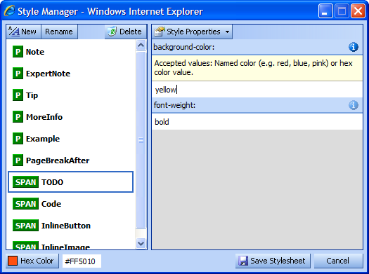
The Style Manager pop-up box will appear. To create a new style, hit the New button.
 |
Select an HTML element the style will be used with, then type a name for the style. Style names can only include numbers and letters and must start with a letter.
 |
Reserved Style Prefixes
The prefixes 'cms' and 'tmp' are reserved by the Content Manager. Style names you create must start with different letters.
Style Properties are added to the selected Style on the right side of the Style Manager. To define a property for the style, select it from the list. This adds the Style Property to the list of properties currently defined for the selected Style. Type the desired value for the property in the space beneath its name.
For suggested property values, hit the  button of the property.
 |
Note: Not all valid CSS properties are available in the Style Properties list. CSS properties were selected for the list based on their compatibility across different web browser platforms and the likelihood of being used in content areas.
When finished building the styles you need, hit the Save Stylesheet button. The current page content will automatically refresh with the new style changes. The Style Manager pop-up stays open in case you need to make additional changes.
Once styles have been created, they can be applied by positioning the cursor in the intended element (or in the case of SPAN styles, selecting the intended text) and clicking on the style in the Styles tab. For each style type that has been created, a 'Default' style is also made available in the bottom section of the Styles tab. These default styles can be used to remove styles that have been applied.
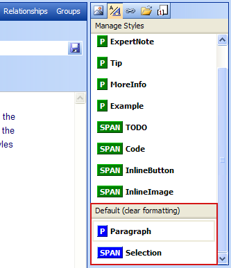 |
| Default styles |
Using the Files tab ( ), files can be uploaded and linked to from within the page. Files can be of any format (PDF, Word, Excel, etc.). Keep in mind with file formats that the site visitor must have access to a program that can view that type of file.
 |
| Files tab |
Before they can be linked, files must be located on your computer and uploaded. Hit the Manage Files button to upload files.
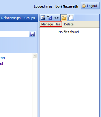 |
| Manage Files button |
Once you hit the Manage Files button, the File Manager pop-up box will appear. Hit the Browse... button to locate files on your computer.
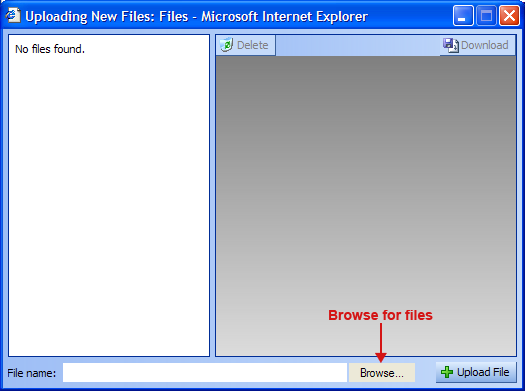 |
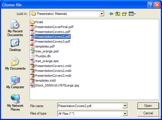
Once Browse has been selected, a standard Windows file selection dialog box appears. Change to the place on your computer where you have local copies of the files you wish to upload. Once the desired file has been found, select it and hit Open.
 |
Note: Files are grouped together by web page. Files uploaded for one web page will not be selectable when editing another web page (the file must be uploaded separately for each page). This is to prevent the situation where a file no longer used on one web page is deleted, causing a broken link to appear on another web page that shares the same file. Files are not shared, so this problem cannot occur.
Each uploaded file must have a unique name. When uploading files of the same name, the uploaded file will overwrite the existing file.
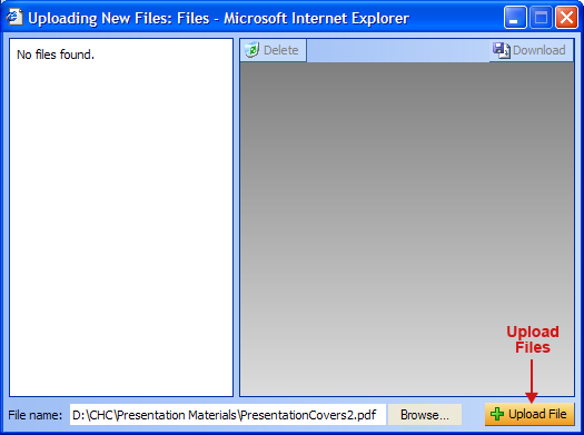
The name of the selected file (along with its path) will appear in the File Name field to the left of the Browse... button. To upload the file, hit the Upload File ( ) button.
 |
After uploading a file, the name of the file will appear in the list on the left side of the File Manager as well as in the Files tab in the main Content Manager window.
Information about the currently selected file will appear on the right of the File Manager. If the wrong file was uploaded, hit the Delete button ( ) to remove it. If you would like to save a local copy of a file that has been uploaded, hit the Download button (
 ).
).
The Link Manager is very robust and allows for many different types of linking. Links can be made from one page to another (Page Links), to graphics (Image Links) and to documents (File Links). Additionally, links can be made to email addresses, FTP servers, and more. Each type of link is detailed below.
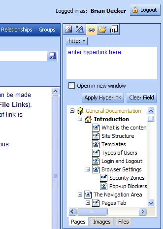
The Links tab ( ) interface is a bit different from the other tabs, and allows for tremendous flexibility in generating links.
 |
| Links tab |
If you type a URL within the content area of the site, for example, 'www.amazon.com', the content manager will automatically create a link to this site. This link can be removed by highlighting the link and hitting the  button, or by right-clicking on the link and selecting Remove Hyperlink from the context menu.
By selecting the http: button, a dropdown menu provides a list of the link types that can be created ('http' is the default type). Following are the available choices.
Link type dropdown menu
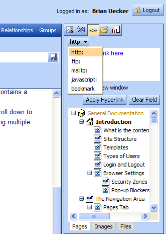
http:
HTTP allows for the creaton of links to web pages.
ftp:
FTP allows for the creation of links to FTP files.
mailto:
Mailto allows for the creation of links to email addresses.
javascript:
Javascript allows for the creation of links that launch Javascript functions. This is typically used when special pop-up windows need to be created. For example, links to full size images create a custom Javascript link for this purpose.
bookmark
A bookmark is a reference to content within a page. When a link referring to a bookmark is clicked, the bookmark is scrolled into web browser view. For
example, if a page contains a bookmark named 'Notes', a URL to that page reading http://www.example.com/Page.asp#Notes will load the page and instantly scroll down to where the bookmark was placed. It is used most commonly with long pages having multiple sections to make it easier to go straight to specific content.
Page links allow linking from one page to another within the site.
To create a page link, first, from the Pages tab of the Link Manager, scroll to find the name of the page to which you wish to link. Click on that page. You will see the link to that page appear at the top of the Link Manager.
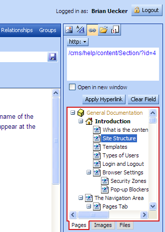 |
| Creating a page link |
Second, type in the words within the content area that will be your link and highlight these words. Then hit the Apply Hyperlink button to make the link. The page now has a working link to the selected page.
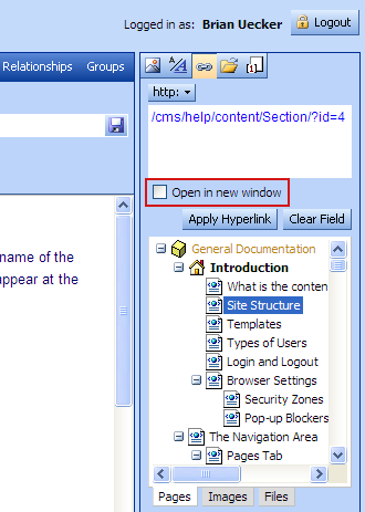
The Open in New Window check box enables the link to open up in a new browser window. This is useful when linking to an external Website or document, keeping the current site in the existing browser window.
 |
| 'Open in new window' link option |
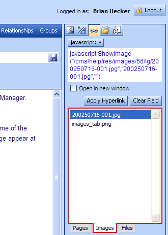
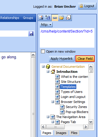
Image links allow linking to a full-size image that has been uploaded using the Image Manager. When the link is activated, the full-size image will appear in a new browser window.
To create an image link, first, from the Images tab of the Link Manager, locate the name of the image to which you wish to link. Click on that image. You will see the link to that image appear at the top of the Link Manager.
 |
| Creating an image link |
Second, type in the words within the content area that will be your link, then highlight these words. Then hit the Apply Hyperlink button to make the link. The page now has a working link to the selected image.
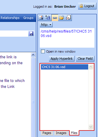
File links allow linking to a file that has been uploaded using the File Manager. When the link is activated, the file will load in a browser window or prompt for a download location, depending on the file type.
To create a file link, first, from the Files tab of the Link Manager, locate the name of the file to which you wish to link. Click on that file. You will see the link to that file appear at the top of the Link Manager.
 |
| Creating a file link |
Second, type in the words within the content area that will be your link, then highlight these words. Then hit the Apply Hyperlink button to make the link. The page now has a working link to the selected file.
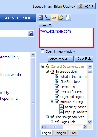
External links are outside the site, linking to pages on other websites. To create an external link, first, at the top of the Link Manager window, type in the URL to the external web page.
Second, type in the words within the content area that will be your link, then highlight these words. Then hit the Apply Hyperlink button to make the link.
When linking to external sites, you may wish to open the link in a new browser window. By checking the Open in New Window checkbox before applying the, the web page will open in a new browser window.
 |
| Creating an external link |
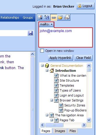
To create an email link, first, at the top of the Link Manager window, select mailto: from the dropdown menu. Second, type in the words within the content area that will be your link, then highlight these words. Third, type in the email address. Finally, hit the Apply Hyperlink button. The page now has a working email link.
 |
| Creating an email link |
A link can be associated with an image in the content area so that when the image is clicked, the link is activated. In order to establish an image link, first type in the URL for the link at the top of the Link Manager window. Check the Open in New Window checkbox if you desire the link to appear in a new browser window. Finally, right-click on the image and select Link from the context menu.
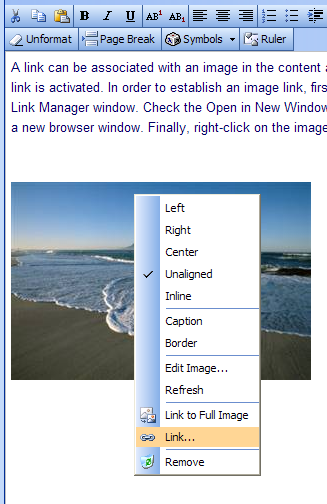 |
| Adding a link to an image |
When setting several links on a page, it may be helpful to clear the link text area as you go along. To do so, simply hit the Clear Field button.
 |
| Clearing the link text area |
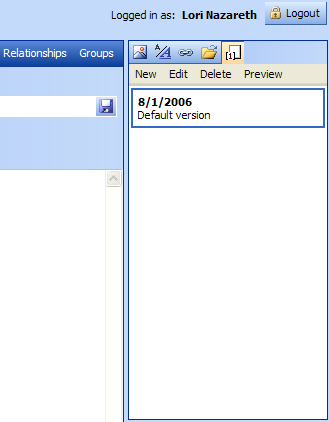
By selecting the Versions tab ( ), you can create multiple versions for a page, preview each version's content, and switch between versions in the editor.
Versions 'go live'�become viewable to the general public�based on the date of the version. This can be particularly helpful for seasonal information and planning significant content revisions�entering the content in advance and letting the content manager automatically show the content on the specified date.
 |
| Versions tab |
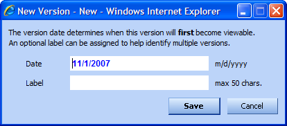
New creates a new version of the current page that you are working on. By entering a date and label, you can create multiple versions of the same page. The page that will be displayed on the public website will be the one with the most current date. So, if you have content that you would like to change out on June 1st, you can create a new version of the page much earlier in the year, and on June 1st it will go live, replacing the previous page.
 |
Edit allows you to change the date or label for a particular version.
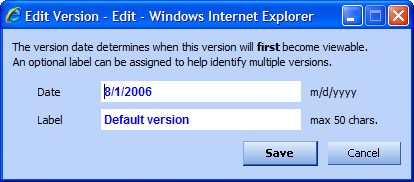 |
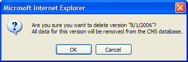
Delete allows you to delete a particular version. A pop-up confirmation dialog will appear to make sure you have not hit delete in error. Hit OK to delete or Cancel to keep.
 |
Preview is very helpful during editing for �previewing� a page before it goes live. As you are making edits that have been saved but not yet published, you can hit Preview to see how the page will appear on the live site.
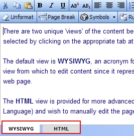
There are two different 'views' of the content being edited, WYSIWYG and HTML. The views are selected by clicking on the appropriate tab at the bottom of the content area.
The default view is WYSIWYG, an acronym for 'What You See Is What You Get'. This is the easiest view from which to edit content since it represents the same layout that will be seen on the actual web page.
The HTML view is provided for more advanced users who are familiar with HTML (Hypertext Markup Language) and wish to manually edit the page's HTML content.
 |
| WYSIWYG and HTML view tabs |
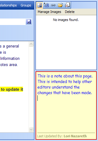
In addition to normal content, each page in the website has a Notes area for use as a general purpose 'scratch pad' for the page. Notes are automatically saved when the current page is unloaded, whether by changing to another page or by closing the web browser window. Information about the last user to update the notes on a given page is shown at the bottom of the Notes area.
Notes are not part of page content and can only be viewed in the Content Manager.
 |
| Page notes |
In addition to traditional content, some pages require special features. These include banner images that exist outside the content area, email addresses for contact forms, and other special information.
The controls for these features are built into the page template and appear at the bottom of the content area in a space known as the Control Tray. An example of a Control Tray is shown here. The exact appearance will depend on page requirements.
More information about special pages for this website can be found in the appendices to this documentation.
) |
| The Control Tray |